


Last year ended very differently to how it started, as the early optimism around Covid-19 vaccines and the global re-opening gave way to worries about new coronavirus variants and persistently high inflation. 
Despite this, 2021 was another strong year for investors with the central bank-fuelled ‘everything rally’ pushing global equities up more than 20% and encouraging investors to take a risk-on stance.
How this will change in 2022, as central banks tighten policy, remains to be seen, but the 10 charts below reveal how markets have performed across the past 12 months.
Asset classes
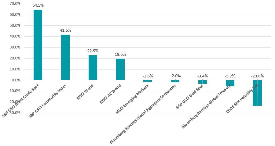
Last year’s opening-up of the global economy after 2020’s lockdowns led a surge in demand and supply bottlenecks, resulting in an ongoing inflation spike. As the chart below shows, this meant that commodities jumped and outperformed global equities.
Performance of asset classes in 2021
Source: FinXL
Stronger inflation also caused bonds to fall, as fixed income assets tend to suffer when central banks lift interest rates to control rising prices. Gold, which is a traditional inflation hedge, also fell in 2021.
Geography
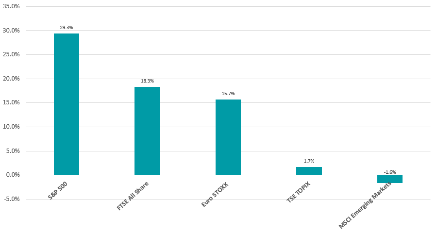
The US stock market enjoyed another strong year in 2021, with the S&P 500 posting a total return of 29.3% and pushing onto a new record high.
Performance by geographical regional in 2021
Source: FinXL
While the year started with a contested presidential election and the assault on the Capitol, followed by supply chain disruptions and higher-than-expected inflation, the US is undergoing a robust economic recovery. This is evident in the country’s labour market, where unemployment claims are sitting at a 52-year low.
However, it has been another year where the bulk of returns have been concentrated in a handful of stocks – namely, Microsoft, Google, Apple, Nvidia and Tesla.
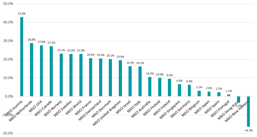
Of the 23 developed markets that make up the MSCI World index, the US sits in third place having been beaten by Austria and the Netherlands, which benefitted from a rally in European banks.
Performance of developed market equities in 2021
Source: FinXL
The MSCI New Zealand index was the worst performer, in sterling terms. While some of this can be attributed to currency movements, the country underperformed international peers because it has a high proportion of defensive stocks, which tend to fall when investors are anticipating higher interest rates.
Performance of emerging market equities in 2021
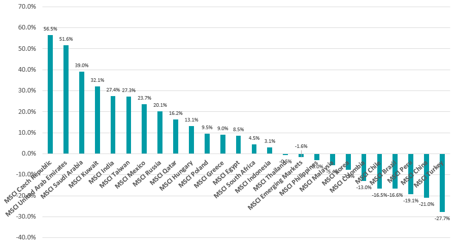
Source: FinXL
Moving over to the 25 countries in the MSCI Emerging Markets index, the highest return in sterling came from the Czech Republic. The Czech central bank is in a rate-hiking cycle, which has boosted the shares of domestic banks as higher rates would increase their profits.
The stock markets of oil-producing nations such as the United Arab Emirates, Saudi Arabia and Kuwait climbed on the back of higher commodity prices, while China and South American countries made some of the year’s biggest losses.
Commodities
The large chart below shows as many commodities as possible, to give a sense of just how strong inflationary pressures were in 2021.
Energy commodities such as oil and gasoline jumped in price last year as the global economy re-booted, but there were strong price rises in other areas such as tin and coffee.
Performance of commodities in 2021
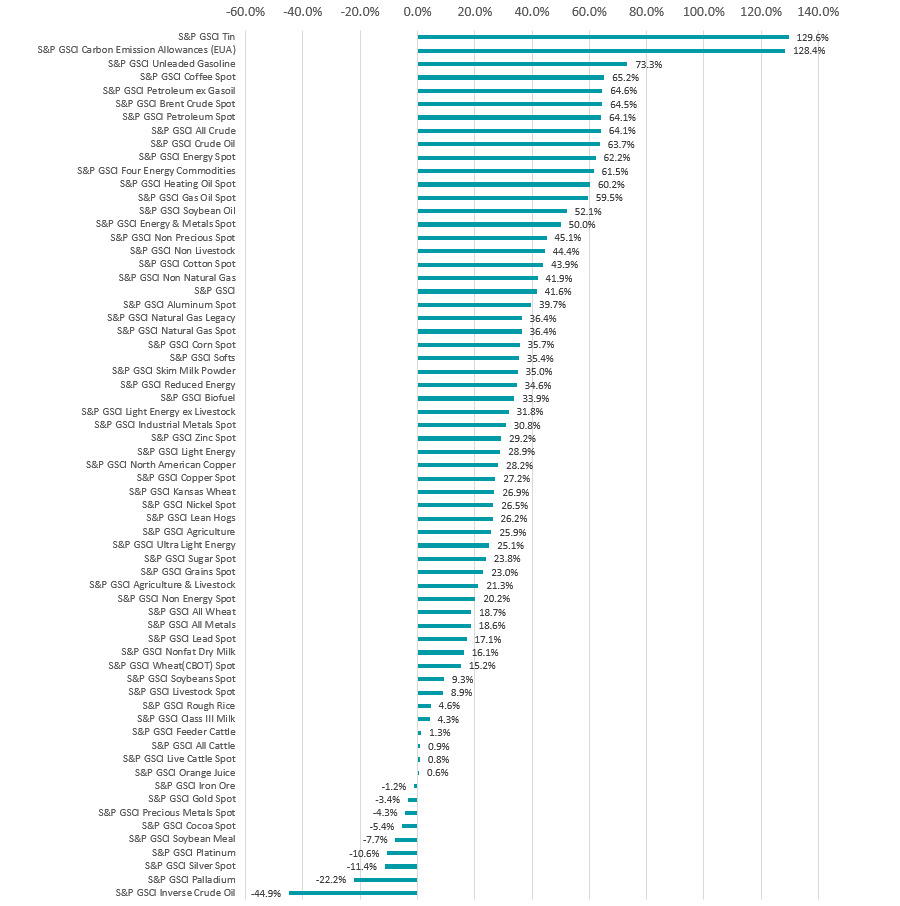
Source: FinXL
Only a handful of commodities fell in price in 2021, typically precious metals such as gold, silver and palladium. However, iron ore also fell after demand dropped when China slashed steel production.
Investment style, industry and market cap
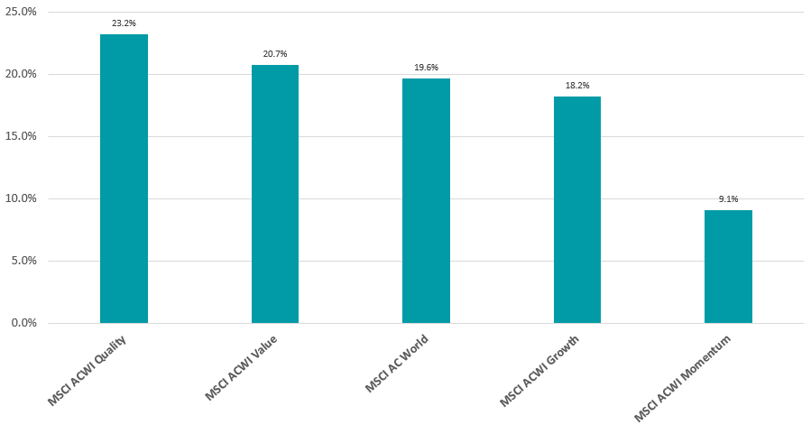
The below chart shows how the various investment styles performed relative to global equities, represented here by the MSCI AC World index.
The ‘re-opening trade’ and expectations of higher inflation meant that many investors went into 2021 anticipating a rally for the value style, which had spent much of the past decade trailing behind the growth style. Value stocks did beat growth in 2021, but only by about 2.5 percentage points.
Performance of investment style in 2021
Source: FinXL
The quality style, however, was the best performing approach as investors sought out the ‘best’ stocks amid the continuing pandemic, rather than embarking on a ‘dash for trash’. But the rotation into value and away from growth meant that the momentum approach (or buying what has previously done well) underperformed.
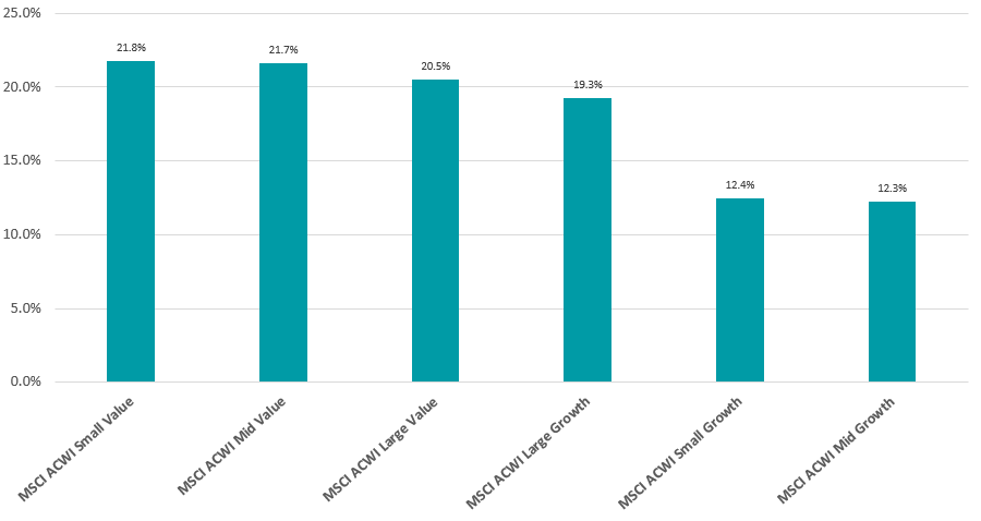
Performance of investment style and market cap in 2021
Source: FinXL
Combing investment style with market capitalisation shows that small-cap value stocks were the best place to be in 2021, as the global re-opening bolstered a risk-on stance among investors and confidence in the economic recovery.
Conversely, the weakest stocks of last year were those in the small- and mid-cap growth buckets, which lagged behind as investors stuck to better-known large-cap growth names.
Fund sectors
Putting all of the above together to show how the various Investment Association sectors performed across 2021, the best equity peer group was IA India/Indian Subcontinent – where the average fund was up 28.3%.
Analysts put the rally in Indian equities down to the country’s strong economic rebound, massive vaccination programme and accommodative monetary policy, combined with ample global liquidity from the likes of the Federal Reserve.
Performance of equity fund sectors in 2021
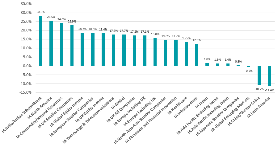
Source: FinXL
US equities, commodity stocks and UK smaller companies also generated strong gains last year, with each of these sectors making a total return in excess of 20%. The only losses came from emerging market sector, especially China and Latin America.
Strong returns were harder to find in the fixed income peer groups, however, as the chart below demonstrates.
Performance of bond fund sectors in 2021
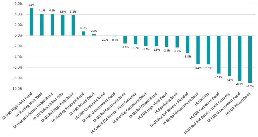
Source: FinXL
The US, UK and global high yield sectors, as well as the global and UK inflation-linked peer groups, made the best returns as investors looked for fixed income assets that would hold up if inflation continued to rise and central banks lifted rates.
But most bond peer groups posted losses, on average, with IA EUR Mixed Bond being the hardest hit with fall of close to 9%.
Performance of multi-asset and ‘other’ fund sectors in 2021
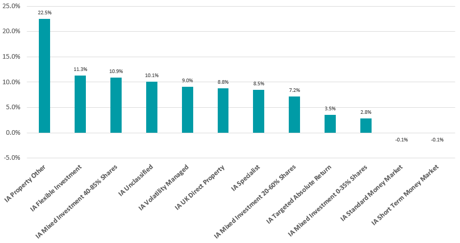
Source: FinXL
In the remaining Investment Association peer groups, IA Property Other led the pack with an average total return of 22.5%. While property has been out of favour for several years, the return of workers to offices in 2021 supported the sector’s returns.
The riskier multi-asset sectors performed better than cautious peer groups, while investors lost money if they remained in cash.